Choosing the ideal color palette for room wall art can be daunting, but it plays a crucial role in creating a harmonious and visually pleasing living space. To help you achieve the perfect look, this article will explore five effective techniques to elevate your interior decor with captivating prints.
Whether aiming for a cozy and serene atmosphere or a bold and vibrant statement, these techniques will guide you toward making the right color choices for your room’s wall art, ensuring a truly exceptional living space that reflects your style and taste.
Complementary Contrasts
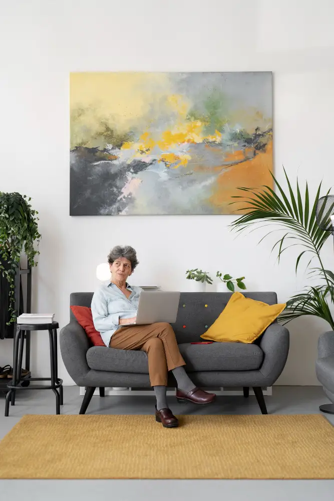
One of the fundamental principles of color theory is the concept of complementary colors. These are hues that sit opposite each other on the color wheel.
Complementary colors can create a dynamic and visually striking effect in your room. For instance, pairing a deep blue wall with artwork featuring warm orange tones can create a captivating contrast that draws the eye and adds depth to your space.
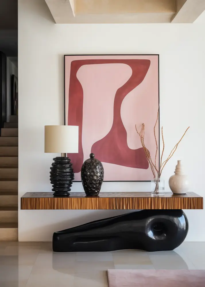
Analogous Elegance
Analogous color schemes involve selecting hues adjacent to each other on the color wheel. This approach creates a sense of unity and harmony within your room.
Choose wall art incorporating colors from a neighboring spectrum to achieve this look. For example, if you have soft green walls, opt for artwork with shades of blue and yellow. This will result in a cohesive and soothing ambiance.
Monochromatic Mastery
A monochromatic color scheme uses different shades and tints of a single color. This technique can bring a sense of sophistication and serenity to your room.
To execute this, pick a dominant color for your walls and select artwork that showcases various shades of that color. For instance, if you choose a calming blue for your walls, consider wall art incorporating lighter and darker shades of blue and subtle hints of white or gray.
Triadic Brilliance
Triadic color schemes involve selecting three evenly spaced colors around the color wheel. This approach creates a balanced and vibrant atmosphere in your room.
Choose three primary colors that resonate with your decor vision to make this technique work. For example, select artwork that harmoniously combines these hues if you opt for a triadic scheme of red, yellow, and blue. This will infuse your room with energy and visual interest.
Neutral Serenity
Neutrals are a timeless choice for room wall art, as they offer a sense of understated elegance and flexibility. Using a neutral color palette for your walls and artwork allows you to create a serene and versatile space.
Consider shades like beige, gray, or taupe for your walls, and select wall art that incorporates similar neutral tones. You can then introduce pops of color through decor accents like throw pillows or area rugs, providing a balanced and inviting atmosphere.
The Takeaway
Nailing the perfect color palette for your room wall art involves understanding color theory and considering practical factors like lighting and room purpose. By carefully selecting suitable color prints and considering these five techniques, you can transform your living space into a visually stunning and harmonious environment that reflects your style and personality.
Read More
 A Guide to Foam Insulation: Everything You Need to Know
 Top 4 Factors to Consider When Renovating Your Small Bungalow
 How to Attract Direct Real Estate Buyers: Proven Strategies for Sellers
 The Ultimate Guide to Choosing the Right Replacement Window Company
 The Importance of Permits in Home Renovation: What You Need to Know
Recap